| typography
The good, the bad, and the ugly
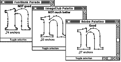
Where great differences in letter forms become evident is in the way the author/artist/designer has decided to place these points and curves in the originating software. Which minute features are included or omitted? With electronics there are no longer any rules. The same typeface (regardless of its name) may look very different from different creators.
[more]
thanks to DANGEROUSMETA! |