| how big is a billion?
The L-Curve
The income distribution of the United States
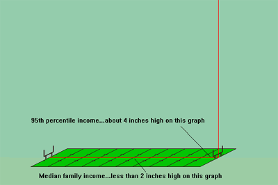
Partial Graph of the U.S. Income Distribution. The graph represents the population of the United States lined up, left to right, according to income. The height of the graph at any point is the height of a stack of $100 bills equaling that person's income.
Imagine the population of the United States stretched across a football field in order of income, from poorest to richest. Now imagine a stack of $100 bills representing each person's income. (A 1-inch stack of $100 bills is $25,000.) The red line represents the heights of those stacks compared to a football field. I call this graph the "L-Curve."
The red line in the first picture is the beginning of the U. S. income distribution. On the scale of the football field the line slopes gradually from zero on the left to less than 2-inches high at the 50-yard line ($39,000), to about 4-inches high at the 95-yard line ($132,000). On this scale the entire graph is less than one pixel high, up to this point. It is not until you are well past the 99-yard line that you hit the $1 million mark: a stack of $100 bills 40-inches high. There were over 144,000 people who turned in IRS returns in 1997 with adjusted gross incomes of $1 million or more.
[more]
This is the first graph. It takes two to show just how high that vertical red line goes for the billionaires. Go see.
thanks to Spitting Image |